Panel 1.5.0 Release

What is Panel?
Panel is an open-source Python library that allows you to easily create powerful tools, dashboards, and complex applications entirely in Python. With its “batteries-included” philosophy, Panel brings the full PyData ecosystem, advanced data tables, and much more to your fingertips. It offers both high-level reactive APIs and lower-level callback-based APIs, enabling you to quickly build exploratory applications or develop complex, multi-page apps with rich interactivity. As a member of the HoloViz ecosystem, Panel provides seamless integration with a suite of tools designed for data exploration.
New Release!
We are excited to announce the 1.5.0 release of Panel! While this is technically a minor release, it significantly expands the range of possibilities in Panel. Here’s a high-level overview of the most important features:
- Easily create new components: It is now trivially easy to build new JavaScript, React, or AnyWidget-based components with hot-reload, built-in compilation, and bundling. Likewise for Python based widgets, panes and layouts.
- Native FastAPI integration: We’ve added native support for running Panel apps on a FastAPI server.
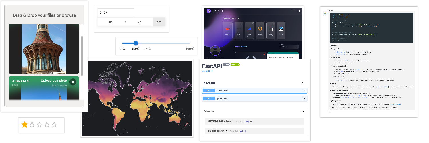
- New components: This release includes several new components, such as the
Placeholderpane,FileDropperandTimePickerwidgets, and theChatStepcomponent. - Improved chat interface: We have greatly enhanced the
ChatInterfaceuser experience by improving its design and performance. - PY.CAFE support: You can now run Panel apps in PY.CAFE.
- Improved contributor experience: We’ve made significant improvements to the contributor experience.
- Numerous enhancements: This release includes a large number of enhancements and bug fixes, particularly for the
Tabulatorcomponent.
We greatly appreciate the contributions from 21 individuals to this release. We’d like to extend a warm welcome to our new contributors: @twobitunicorn, @justinwiley, @dwr-psandhu, @jordansamuels, @gandhis1, @jeffrey-hicks, @kdheepak, @sjdemartini, @alfredocarella, and @pmeier. We also want to acknowledge our returning contributors: @cdeil, @Coderambling, @jrycw, and @TBym. Finally, we give special recognition to our dedicated core contributors, including @Hoxbro, @MarcSkovMadsen, @ahuang11, @maximlt, @mattpap, @jbednar, and @philippjfr.
If you’re using Anaconda, you can install the latest version of Panel with conda install panel. If you prefer pip, use pip install panel.
Create New Components
Previously, creating custom components in Panel often required building a Bokeh extension, which involved complex build tools to set up and distribute the compiled JavaScript (JS) bundle. Alternatively, you could write a ReactiveHTML component, but this process often resulted in a clunky developer experience.
With this release, we’re introducing a new set of component base classes that make it effortless to build components, wrap external JS and React libraries, and distribute these components as optimized bundles within your package or app.
Introducing ESM Components
The new base classes — JSComponent, ReactComponent, and AnyWidgetComponent — leverage ECMAScript modules (ESM) to simplify the process of building reusable components. ESM modules make it easier to import other libraries, thanks to import and export specifiers that allow developers to efficiently import functions, objects, and classes from other modules.
To declare a new component, simply define an ESM module, either inline or by providing a path to a .js(x) or .ts(x) file. The component will be compiled on the fly, with imports dynamically loaded from a Content Delivery Network (CDN).
import param

from panel.custom import JSComponent

css = """
button {
  background-color: #4CAF50;
  color: white;
  border: none;
  padding: 12px 24px;
  font-size: 16px;
  border-radius: 8px;
}
"""

class ConfettiButton(JSComponent):

    clicks = param.Integer(default=0)

    _esm = """
    import confetti from "https://esm.sh/canvas-confetti@1.6.0";

    export function render({ model }) {
      const button = document.createElement('button')
      button.addEventListener('click', () => { model.clicks += 1})
      const update = () => {
        confetti()
        button.innerText = `Clicked ${model.clicks} times`
      }
      model.on('clicks', update)
      update()
      return button
    }"""

    _stylesheets = [css]

ConfettiButton()
Breaking this down we can see how easy it is to create a DOM element, attach event listeners and finally, react to and update parameter values.
React Integration
We can also implement this component as a ReactComponent making it trivially easy to build complex UIs:
from panel.custom import ReactComponent

class ConfettiButton(ReactComponent):

    clicks = param.Integer(default=0)

    _esm = """
    import confetti from "https://esm.sh/canvas-confetti@1.6.0";

    export function render({ model }) {
      const [clicks, setClicks] = model.useState('clicks')
      React.useEffect(() => { confetti() }, [clicks])
      return (
        <button onClick={() => setClicks(clicks+1)}>
          Clicked {clicks} times
        </button>
      )
    }
    """

    _stylesheets = [css]

ConfettiButton()
As you can see we can use useState hooks to get and set parameter values reactively and can return React components from our render function.
AnyWidget Compatibility
We’d like to give a shoutout to the anywidget project and especially its author, Trevor Manz, for valuable discussions that inspired many of the ideas behind these component classes and influenced the API. We also provide an AnyWidgetComponent class that mirrors the JavaScript (JS) API of AnyWidget, making it possible to reuse AnyWidget components natively in Panel.
To demonstrate this, we will fetch the JS implementation of the CarbonPlan AnyWidget directly from GitHub (though we advise against doing this in a production environment) and implement only the Python wrapper class:
import requests

from panel.custom import AnyWidgetComponent

class Carbonplan(AnyWidgetComponent):
    _esm = requests.get('https://raw.githubusercontent.com/manzt/carbonplan-maps/3f8603042522e83fba0e7abddea63b0463a690e0/carbonplan_maps/widget.js').text

    source = param.String(allow_None=False)
    variable = param.String(allow_None=False)
    dimensions = param.Tuple(allow_None=False)
    height = param.String(default='300px')
    opacity = param.Number(default=1.0)
    colormap = param.String(default='warm')
    clim = param.Range(default=(-20, 30))
    region = param.Boolean(default=False)
    selector = param.Dict(default={})
    mode = param.String(default='texture')
    data = param.Parameter()

Carbonplan(
    source="https://carbonplan-maps.s3.us-west-2.amazonaws.com/v2/demo/2d/tavg",
    variable="tavg",
    dimensions=("y", "x"),
    sizing_mode='stretch_width',
    height='500px'
)
Developer Experience First
When developing these component classes, we prioritized enhancing the developer experience. With watchfiles installed and the --dev flag enabled (formerly known as --autoreload), you can benefit from hot-reloading while developing your component.
Below is a demonstration of building a simple React form from scratch using Material UI components:
Create Native Components
Another thing we made sure of is that you can easily build components that follow the API specification for native Panel components, whether that is a Widget, Pane or Panel (i.e. layout). You can simply create mix-ins of the JSComponent, ReactComponent, PyComponent and the WidgetBase, PaneBase or ListPanel classes giving you a component that behaves just like a native Panel component.
For more information see some of our how-to guides here:
Simple Compilation and Bundling
After building a component, we aimed to make the bundling process for distribution as straightforward as possible. While loading external libraries from a CDN is fine during development, creating a minimized bundle for production is often a better choice. This can be done easily with the following command:
panel compile form.py:FormThis command compiles a single component. To compile multiple components in one module into a single bundle, use:
panel compile form.pyThe only dependencies required are node.js and esbuild, which can be easily installed with conda or your preferred Node installer (e.g., npx).
To learn more about imports, compilation, and bundling, see the how-to guide.
Native FastAPI Integration
FastAPI as a library is incredibly popular and we have received multiple requests to make it easier to integrate Panel with FastAPI. As of today that is a reality! Together with Philip Meier (@pmeier) from Quansight we created bokeh-fastapi, which allows the Bokeh server protocol to run inside a FastAPI application. By installing the additional package bokeh-fastapi, you can now run Panel apps natively on a FastAPI server, e.g. using uvicorn.
To get started simply pip install panel[fastapi] and very soon you’ll also be able to conda install -c conda-forge panel fastapi bokeh-fastapi.
Panel provides two simple APIs for integrating your Panel applications with FastAPI.
The first a simple decorator to add a function defining a Panel app to the FastAPI application:
import panel as pn

from fastapi import FastAPI
from panel.io.fastapi import add_application

app = FastAPI()

@app.get("/")
async def read_root():
    return {"Hello": "World"}

@add_application('/panel', app=app, title='My Panel App')
def create_panel_app():
    slider = pn.widgets.IntSlider(name='Slider', start=0, end=10, value=3)
    return slider.rx() * '⭐'
Now we can run the application with:
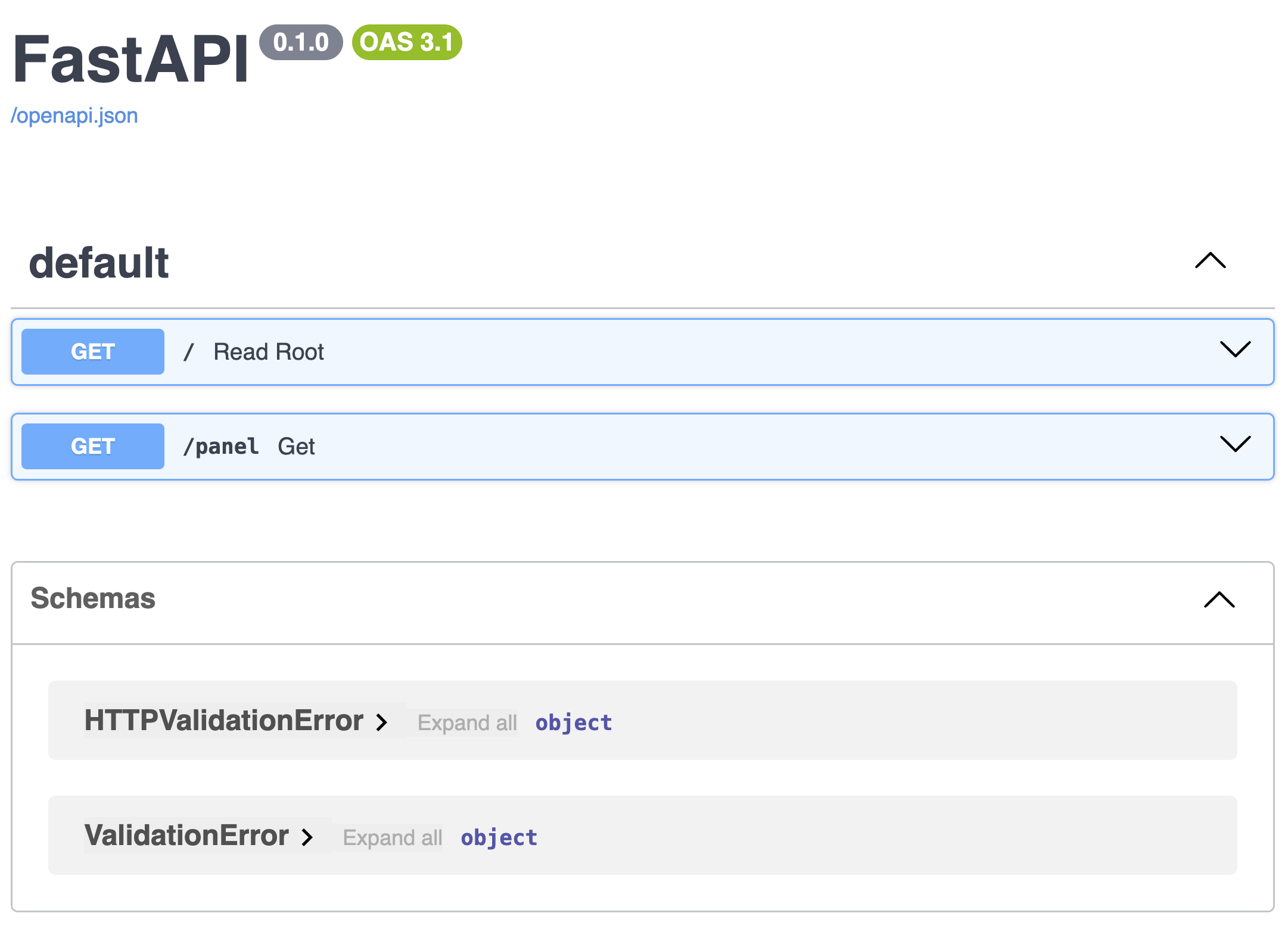
fastapi dev main.py # or uvicorn main:appAfter visiting http://localhost:8000/docs you should see the following output:

Of course you can also add multiple applications at once, whether that is a Panel app declared in a script, a Panel object or a function as above:
from panel.io.fastapi import add_applications

app = FastAPI()

...

add_applications({
    "/panel_app1": create_panel_app,
    "/panel_app2": pn.Column('I am a Panel object!'),
    "/panel_app3": "my_panel_app.py"
}, app=app)
Read more in the FastAPI how-to guide.
New Components
As always, it wouldn’t be a new Panel release without at least a few new components being added to the core library.
FileDropper
The new FileDropper widget is an advanced version of the FileInput widget with a host of exciting features:
- Preview of images and PDF files
- Upload progress bars
- Chunked upload support, enabling the upload of files of any size
- Improved support for multiple files and directories
Give it a try: drop some images here and watch the preview in action!
pn.widgets.FileDropper(height=400, multiple=True)TimePicker
The TimePicker complements the other various time and date based input widget providing a dedicated way to specify a time.
pn.Column(pn.widgets.TimePicker(value='13:27'), height=100)ChatStep
The ChatStep provides a convenient way to progressively update a task being performed and collapse the output when done.
step = pn.chat.ChatStep(success_title='Task completed', width=300)

with step:
    step.stream('Working.')
    step.stream('Still working.')
    step.stream('Done.', replace=True)

step
Player and DiscretePlayer
While not entirely new the Player and DiscretePlayer widgets have gotten a lot of love in this release with the ability to give it a label:
pn.widgets.DiscretePlayer(options=[0, 1, 10, 100, 1000, 10000], height=100, name='Log scale')and also reduce the size of the buttons and create a more minimal UI:
pn.widgets.Player(start=0, end=10, show_loop_controls=False, show_value=True, visible_buttons=['pause', 'play'], width=150)Chat Interface UX improvements
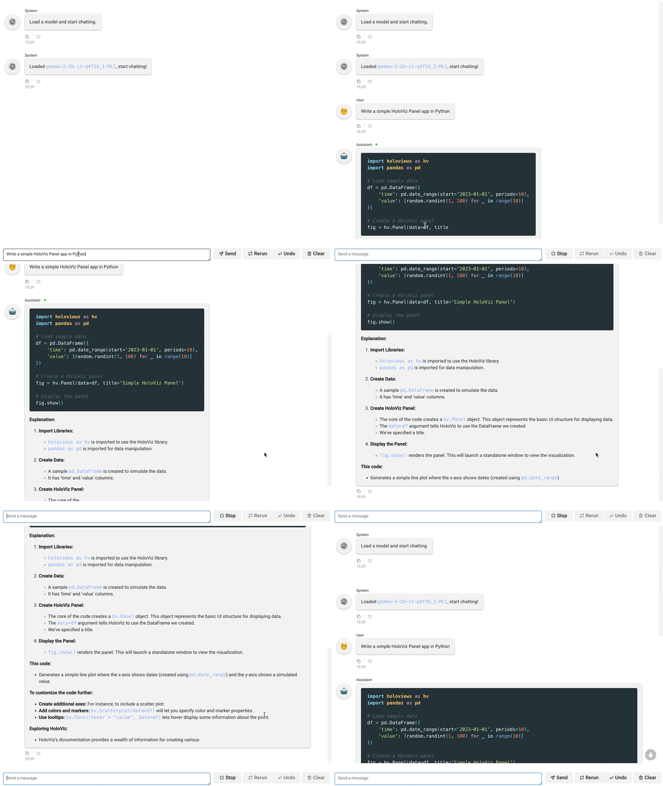
Another major area of focus for us this release was improving the UX of the chat components. Specifically we wanted to ensure that the experience of long chat feeds would be smooth and streaming long chunks of text would be efficient. To that end we implemented automatic diffing for chat messages, ensuring we only send the latest chunk of text (rather than sending all the text each time a new chunk was streamed in).

(Please excuse the fact that the model output is junk 🙂)
Play around with our web-based LLM application here (implemented as a JSComponent).
PY.CAFE Support
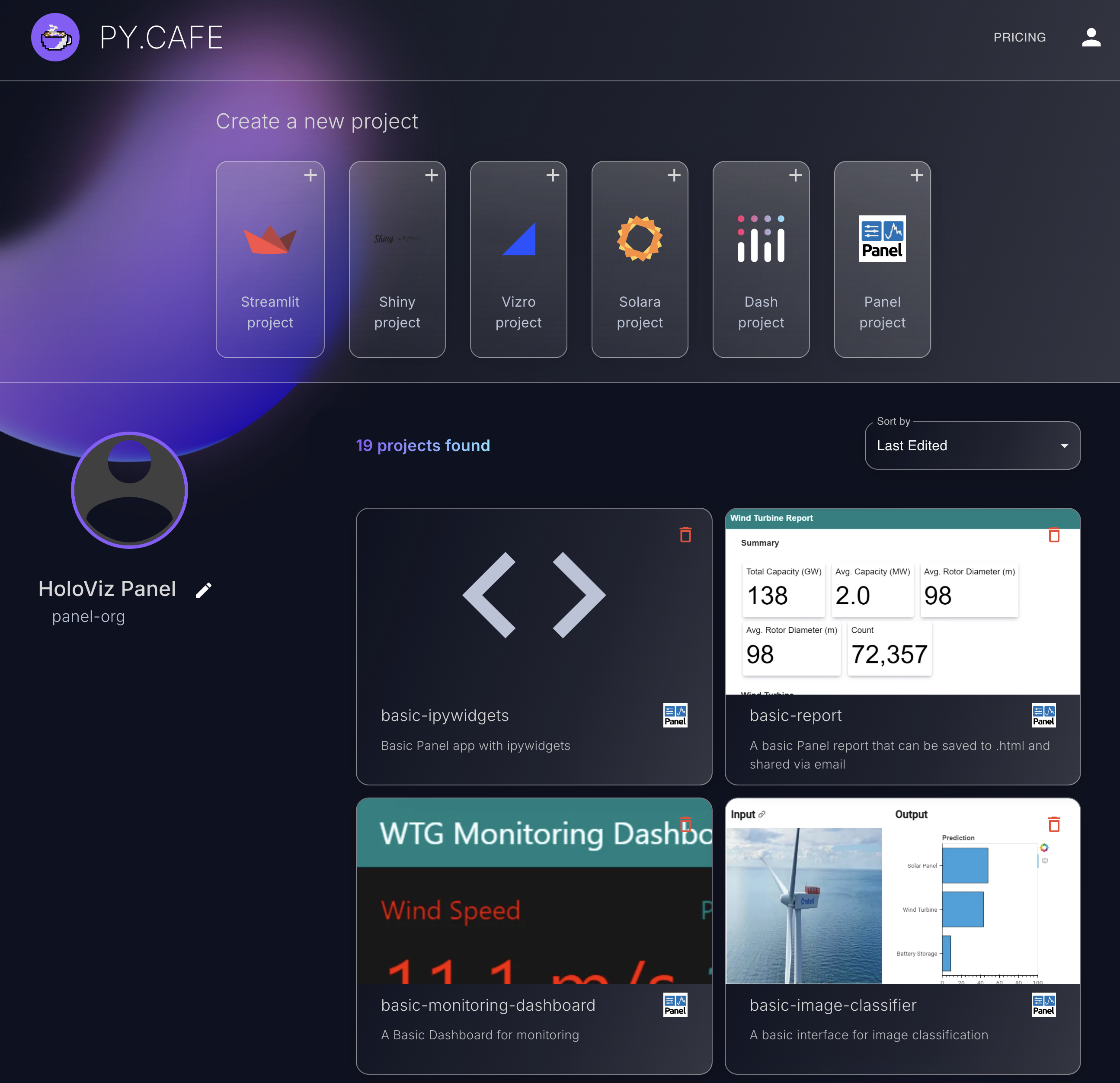
We are very excited to announce that, as of today, Panel is officially supported on py.cafe. PY.CAFE is a platform that allows you to create, run, edit, and share Python applications directly in your browser. You can find our profile with a gallery here.
A big thank you to the entire py.cafe team, and especially to Maarten Breddels, who proved that this could be done in just one afternoon.
Improved Contributor Experience
Lastly, this release significantly enhances the developer experience for Panel contributors. For a long time, building Panel, running tests, and generating documentation were challenging tasks. In this release, we have completely re-architected the developer workflow, leveraging the power of pixi.
On behalf of all current and future Panel contributors, we would like to extend a BIG THANK YOU 🙏 to Simon Høxbro Hansen for his incredible efforts in making this happen.
For more details, check out the updated developer guide.
Changelog
Features
- Allow building custom ESM based
JSComponentandReactComponent(#5593) - Add
Placeholderpane (#6790) - Add
FileDropperwidget (#6826) - Add
ChatStepcomponent to show/hide intermediate steps (#6617) - Add
TimePickerwidget (#7013) - Add
PyComponentbaseclass (#7051) - Add native support for running Panel on FastAPI server (#7205)
Enhancements
- Allow callbacks after append and stream (#6805)
- Enable directory uploads with
FileInput(#6808) - Make
autoreloadrobust to syntax errors and empty apps (#7028) - Add support for automatically determining optimal
Tabulator.page_size(#6978) - Various typing improvements (#7081, #7092, #7094, #7132)
- Display value for player (#7060)
- Optimize rendering and scrolling behavior of
Feed(#7101) - Implement support for multi-index columns in
Tabulator(#7108) - Add placeholder while loading to
ChatFeed(#7042) - Allow streaming chunks to
HTMLandMarkdownpanes (#7125) - Show
Playerinterval value on click (#7064) - Expose
Playeroptions to scale and hide buttons (#7065) - Add
on_keyupandvalue_inputforCodeEditor(#6919) - Detect WebGL support on
BrowserInfo(#6931) - Tweak
ChatMessagelayout (#7209, #7266) - Add nested editor to
Tabulator(#7251) - Support anchor links in
HTMLandMarkdownpanes (#7258, #7263)
Bug fixes
- Ensure
Gaugeis responsively sized (#7034) - Ensure
Tabulatorsortersare correctly synced (#7036) - Ensure
Tabulatorselectionis consistent across paginated, sorted and filtered states (#7058) - Do not propagate clicks on input elements in
Cardheader (#7057) - Ensure
Tabulatorrange selection applies to current view (#7063) - Ensure
Tabulator.selectionis updated when indexes change (#7066) - Ensure
Tabulatorcan be updated with None value (#7067) - Fix issues with PYTHONPATH in Jupyter Preview (#7059)
- Ensure
Tabulatorstyling is correctly applied on multi-index (#7075) - Fix various scrolling related Tabulator issues (#7076)
- Ensure
Tabulatordata is updated after filters are changed (#7074) - Allow controlling
DataFramepane header and cell alignment (#7082) - Highlight active page in
Tabulatorusing Fast Design (#7085) - Ensure follow behavior works when streaming to paginated
Tabulator(#7084) - Avoid events boomeranging from frontend (#7093)
- Correctly map
Tabulatorexpanded indexes when paginated, filtered and sorted (#7103) - Ensure custom
HoloViewsbackends do not error out (#7114) - Ensure events are always dispatched sequentially (#7128)
- Ensure
'multiselect'Tabulator.header_filteruses ‘in’ filter function (#7111) - Ensure no content warning is not displayed when template is added (#7164)
- Make it easy to prompt user for input in
ChatFeed(#7148) - Fix
LaTeXpane MathJax rendering (#7188) - Ensure OAuth expiry is numeric and can be compared (#7191)
- Correctly detect max depth of
NestedSelectif level is empty (#7194) - Make
--setup/--autoreload/--warmwork with--num-procs(#6913) - Ensure error rendering application does not crash server (#7223)
- Refactor
state.notificationsto fix pyodide (#7235) - Handle setting None value on
DateRangePicker(#7240) - Add header_tooltips parameter to
Tabulator(#7241) - Fix issue using
Tabulator.header_filterwith recent Pandas versions (#7242) - Fix setting of
Dialbackground (#7261) - Fix issues when loading multiple times in a Jupyter(Lab) session (#7269)
