Panel 0.12.0 Release

What is Panel?
Panel is an open-source library that lets you create custom interactive web apps and dashboards by connecting widgets to plots, images, tables, and text - all while writing only Python!
Panel integrates seamlessly with your existing work:
- Your code: Step into Panel with your existing work :) Continue to use the PyData ecosystem that you already know and love: matplotlib, seaborn, ggplot, bokeh, plotly, altair, echarts, holoviews, dask, datashader, and more!
- Your workflows: Move the same code freely between a Jupyter Notebook (or other interactive prompt), your IDE, and a fully deployable standalone server. Easily switch between exploring your data, building visualizations, adding custom interactivity, sharing with non-technical users, and back again at any point, using the same tools and code throughout.
Please check out the Panel website to find out more.
New release!
We are very pleased to announce the 0.12 release of Panel! This release focuses on adding a number of powerful features requested by our users, including:
- An easy way to build powerful custom components directly from Python using the
ReactiveHTMLclass - A preview button in JupyterLab to quickly develop applications
- A more polished index template and the ability to declare a template globally
- New layout components including a
FlexBoxand resizableGridStackcomponent - A new
Tqdmcomponent to make it easier to display progress bars - A
Terminalcomponent to display logs or even provide an interactive console - New editable slider and
DatetimePickerwidgets - A
PDFpane
However, as Panel is moving towards a 1.0 release the large number of bug fixes are almost of equal importance. For a full overview of the changes in this release view the release notes.
Many, many thanks to everyone who filed issues or contributed to this release. In particular we would like to thank @douglas-raillard-arm, @mathrick, @jlstevens, @hyamanieu, @Liam-Deacon, @Stubatiger, @ablythed, @syamajala, @Hoxbro, @jbednar, @brl0, @OBITORASU, @fleming79, dhruvbalwada and @rmorshea for contributing various fixes and improvements and the core developers @xavArtley, @MarcSkovMadsen and @philippjfr for continuing to push the development of Panel.
If you are using Anaconda, you can get the latest Panel with conda install -c pyviz panel , and using pip you can install it with pip install panel.
Custom components
One of the most frequently requested features in Panel was to provide an easy way to lay out or “template” components without having to write a full Jinja2 template. Additionally users have wanted to write custom components without writing and compiling a Bokeh model. To solve both issues with one stone we introduced the new ReactiveHTML class, which links Python parameters to HTML attributes and properties and also allows running scripts defined in Python.
A very simple example that does not even require Python to work is the slideshow below. The JSSlideshow component defines three things:
- The
indexparameter which updates the slideshow when set. - The
_templatedefines an HTML string which is rendered and uses theindexvariable and an inlineonclickcallback. - The
_scriptsdictionary here defines aclickscript which is invoked by theonclickcallback and incremements the index on click:
class JSSlideshow(pn.reactive.ReactiveHTML):

    index = param.Integer(default=0)

    _template = """<img id="img" src="https://picsum.photos/800/300?image=${index}" onclick="${script('click')}"></img>"""

    _scripts = {'click': 'data.index += 1'}

JSSlideshow(width=800, height=300)
The ReactiveHTML component can also be used to lay out other components using pure HTML and CSS, i.e. unlike other Bokeh based layouts it is entirely unmanaged and does not use the bokeh layout engine giving us complete control via CSS. We can also easily link parameters to CSS values:
class CustomLayout(pn.reactive.ReactiveHTML):

    border_color = param.Color(default='#000000')

    border = param.Integer(default=0)

    children = param.List()

    title = param.String()

    _template = """
    <div id="custom-layout" style="border: ${border}px ${border_color} solid;">
      <b>${title}</b>
      ${children}
    </div>
    """

layout = CustomLayout(
    children=[
        pn.widgets.TextInput(width=250),
        pn.widgets.Select(options=['A', 'B', 'C'], width=250)
    ],
    title='My custom layout',
    width=300
)

pn.Row(layout.controls(['border', 'border_color', 'title']), layout)
For a complete guide on building custom ReactiveHTML components see the user guide.
JupyterLab previews
In the last minor release (0.11) we introduced the --autoreload flag which provides a new workflow to quickly build an application and seeing it update whenever you make a change. This approach works great if you use an external editor but we also wanted to improve the experience for Jupyter developers. Once you have installed Panel 0.12.0 you first have to set it up by running:
jupyter serverextension enable panel.io.jupyter_server_extensionOnce set up simply start your Jupyter server and you should now have a Panel icon in the toolbar:

Now let’s have a quick look how easily we can prototype an application or dashboard using the preview extension:
Global template
The inbuilt templates such as the MaterialTemplate, BootstrapTemplate, or the FastTemplate make it easy to generate a nice looking application. However until now they had to be invoked and populated explicitly, starting with this release you may declare a global template by configuring it in the pn.extension. If you paid attention in the video above you would have noticed how easy it is to activate the global template and also switch between the 'default' (light) and 'dark' theme, e.g. above we just ran:
pn.extension(template='fast', theme='dark')Once activated any .servable() call will place that component in the currently registered template and you can even assign components to specific areas inside the template, e.g. to add a component to the sidebar just run component.servable(area='sidebar'). If you want to access the actual template object you can access (and modify) it by using pn.state.template.
New index template
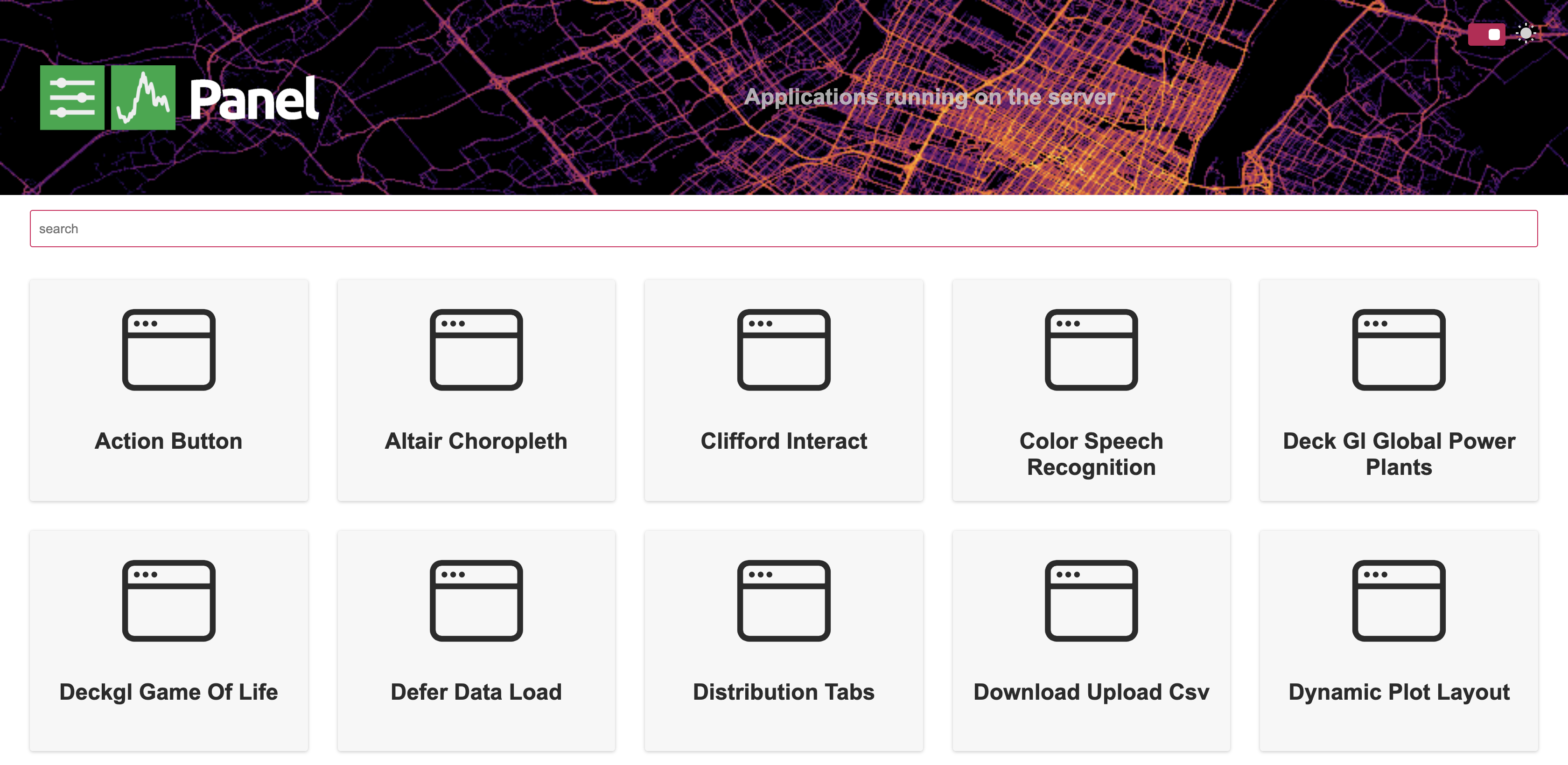
In this release we also overhauled the default index template which provides an overview if you serve multiple applications at once.

If you do not want an index page you can now also use the existing --index option on the commandline to designate a particular application as the “root” application, replacing the index.
FlexBox and GridStack layouts
Thanks to the new ReactiveHTML class we have added two new layouts to Panel which will allow you to build more responsive and customizable apps and dashboards.
FlexBox
The FlexBox layout is a simple wrapper around CSS flex boxes (a full guide on those here. It allows creating containers which reflow their contents either in height or in width when the page resizes. This means you can easily create layouts with fixed size components which resize depending on the size of the browser and therefore offer a better mobile experience out of the box. Here’s an example of a bunch of small boxes, which will reflow as you resize the width of your browser window:
import random

rcolor = lambda: "#%06x" % random.randint(0, 0xFFFFFF)

box = pn.FlexBox(*[pn.pane.HTML(str(i), background=rcolor(), width=100, height=100) for i in range(24)])
box
GridStack
The GridStack component is very similar to the existing GridSpec with one important difference. Thanks to the gridstack.js library each component in the GridStack can be resized and dragged around. Give it a try, each of the components below can be adjusted in size (by dragging from the bottom right) or moved around.
from panel.layout.gridstack import GridStack

gstack = GridStack(width=800, height=400)

gstack[ : , 0: 3] = pn.Spacer(background='red',    margin=0)
gstack[0:2, 3: 9] = pn.Spacer(background='green',  margin=0)
gstack[2:4, 6:12] = pn.Spacer(background='orange', margin=0)
gstack[4:6, 3:12] = pn.Spacer(background='blue',   margin=0)
gstack[0:2, 9:12] = pn.Spacer(background='purple', margin=0)

gstack
The GridStack component also reflects the state of the grid back to Python, which means you can persist that state for return visitors by accessing gstack.state or the gstack.objects dictionary.
New widgets
We have also added a number of new widgets which users had been requesting including the DatetimePicker to complement the existing DatePicker and a family of editable sliders, which allow entering a value via a text field which is linked to the slider:
pn.GridBox(
    pn.widgets.DatetimePicker(name='DatetimePicker'),
    pn.widgets.EditableFloatSlider(name='EditableFloatSlider', start=0, end=3.14),
    pn.widgets.EditableIntSlider(name='EditableIntSlider', start=0, end=10),
    pn.widgets.EditableRangeSlider(name='EditableRangeSlider'),
    ncols=2
)
Tqdm indicator
The new Tqdm indicator provides a wrapper around the popular tqdm library, which provides a convenient interface for displaying progress bars.
import time

tqdm_outer = pn.widgets.Tqdm()
tqdm_inner = pn.widgets.Tqdm(margin=(0, 0, 0, 20))

def run_nested_loop(*events, timeout=0.05):
    for i in tqdm_outer(range(10)):
        for j in tqdm_inner(range(10)):
            time.sleep(timeout)

pn.Column(tqdm_outer, tqdm_inner)
Terminal widget
The new Terminal widget, built on Xterm.js, provides a way to display outputs or logs from running processes as well as an interactive terminal based on for example Bash, Python or IPython.
terminal = pn.widgets.Terminal(
    "Welcome to the Panel Terminal!\nI'm based on xterm.js\n\n",
    options={"cursorBlink": True},
    height=300, sizing_mode='stretch_width'
)

terminal.write("This is written directly to the terminal.\n")
terminal.write("Danish Characters: æøåÆØÅ\n")
terminal.write("Emoji: Python 🐍  Panel ❤️ 😊 \n")
terminal.write("Links: https://panel.holoviz.org\n")

terminal
PDF pane
The PDF pane embeds an .pdf document in a panel if provided a local path, or will link to a remote file if provided a URL:
pdf_pane = pn.pane.PDF('https://www.w3.org/WAI/ER/tests/xhtml/testfiles/resources/pdf/dummy.pdf',
                       width=700, height=300)

pdf_pane
Enhancements and bug fixes
As mentioned before, a large part of this release were the many enhancements and bug fixes to existing functionality. See the full list of enhancements and bug fixes in the release notes. Some highlights include:
- Enhancements for
Templatemodals (#2269, #2523) - Make the Template sidebar width configurable (#2301)
- Improve look and feel and styling of Fast templates (#2303, #2469, #2484, #2488)
- Improve handling of server prefix and proxied deployment scenarios (#2159, #2162)
- Add global configuration variable to always throttle sliders (#2306)
- Ensure
configvariables are configured per user session (#2358, #2455, #2481) - Add
save_layoutandprevent_collisiontoReactTemplateandFastGridTemplate(#2296, #2357) - Add ability to declare root application from
panel serve(#2392) - Add
visibleparameter to all components (#2440) - Support jslinking Parameterized class (#2441)
- Bundle
Tabulatorresources to allow usage in airgapped environment (#2471) - Auto-detect VSCode and Colab comms (#2536)
Roadmap
This release has included a ton of great features but many of the roadmap items from the previous release are still open.
Better debugging and profiling
We also want to make the process of desiging, building, debugging, and optimizing apps easier. We plan to develop new tools to visualize Panel and Param callback and dependency graphs, to help developers understand how data and events propagate through their panels. To help them identify performance bottlenecks, these graphs will be annotated with timing information so that the slow steps can easily be identified.
Documentation overhaul
As we approach a Panel 1.0 release we want to overhaul the documentation so it becomes much easier to find the information you are looking for.
Help us!
Panel is an open-source project and we are always looking for new contributors. Join us the discussion on the Discourse and we would be very excited to get you started contributing! Also please get in touch with us if you work at an organization that would like to support future Panel development, fund new Panel features, or set up a support contract.
Sponsors
Many thanks to our existing sponsors:

