Plotting made easy with hvPlot: 0.9 and 0.10 releases
release
hvplot
Release announcement for hvPlot 0.9 and 0.10, including: Polars integration, Xarray support added to the Explorer, Large timeseries exploration made easier, and more!

What is hvPlot?
hvPlot is an open-source library that offers powerful high-level functionality for data exploration and visualization that doesn’t require you to learn a new API. You can get powerful interactive and compositional Bokeh, Matplotlib, or Plotly plots by simply replacing .plot with .hvplot. hvPlot makes all the analytical power of the HoloViz ecosystem available, using the APIs you already know.
New release!
We are very pleased to announce the 0.10 release of hvPlot! And since we missed announcing the 0.9 release, we are also going to introduce it in this blog post 😊 These releases pack some exciting improvements, specifically:
- Polars integration (0.9)
- Xarray support added to the Explorer, with a few other enhancements (0.9)
- Large time series exploration made even easier (0.9 and 0.10)
- Improved contributor experience (0.10)
- Enhanced plotting API (0.10)
- Documentation enhancements (0.9 and 0.10)
Before diving into detailing each one of these items, we would like to thank everyone who contributed to these releases, including @rdesai9 (first contribution!), @dogbunny (first contribution!), @bikegeek (first contribution!), @iuryt (first contribution!), @MarcoGorelli (first contribution!), @kevinheavey (first contribution!), @jsignell, @MarcSkovMadsen, @ahuang11, @droumis, @Hoxbro, @maximlt and @philippjfr.
If you are using Anaconda, you can get latest hvPlot with conda install hvplot , and using pip you can install it with pip install hvplot.
🌟 An easy way to support hvPlot is to give it a star on Github! 🌟
Polars integration (0.9)
Polars is an alternative DataFrame implementation written in Rust that has become pretty popular. Quite naturally, hvPlot users started to ask for Polars support which was added in version 0.9.0 by Simon (@Hoxbro). This integration in hvPlot allows its users to easily generate plots from Polars DataFrames after importing hvplot.polars. Soon after, Polars’ developers took the decision to directly add a plotting API to Polars which landed in version 0.20.3. We were very pleased to see that they built it on top of hvPlot’s API, simply forwarding .plot calls to hvPlot! We took this as a confirmation of hvPlot’s approach that consists in building a powerful but simple API based on the .plot API originally designed by Pandas.
Reproducing an example from Polars’ documentation, you can see that Polars users can now directly call .plot on their DataFrame instance.
import polars as pl

df = pl.DataFrame(
    {
        "length": [1, 4, 6],
        "width": [4, 5, 6],
        "species": ["setosa", "setosa", "versicolor"],
    }
)
plot = df.plot.scatter(x="length", y="width", by="species")
plot
While we’re very happy with the direction this is going, we are well aware that this first integration is pretty basic as hvPlot has to cast Polars DataFrames to Pandas DataFrames as a pre-processing step (selecting only the columns that will be used by hvPlot). Going forward, we are very interested in adding first-class support for Polars directly into HoloViews, which, when upstreamed to hvPlot, will allow us to stop casting to Pandas and will help preserving the performance benefits brought by using Polars.
Explorer enhancements (0.9)
The Explorer is a Panel-based graphical interface that offers a simple way to select and visualize the kind of plot you want to see your data with, and many options to customize that plot. Pushed by Andrew (@ahuang11), the 0.9 series of releases gradually improved it, two of the main changes include adding Xarray support and displaying code snippets. The Explorer is also now available on the main plotting namespace with .hvplot.explorer().
ds = xr.tutorial.open_dataset("air_temperature")
ds.hvplot.explorer(x="lon", y="lat")
Large time series (0.9 and 0.10)
HoloViews, Datashader and Bokeh have recently been improved to make it easier to explore very large time series. For example, in version 0.9 hvPlot exposed the auto-ranging and downsampling features added to HoloViews. In version 0.10, Demetris (@droumis) contributed the new guide Large Timeseries Data guide describing all the ways hvPlot can help you exploring this sort of data.
df = pd.read_parquet("https://datasets.holoviz.org/sensor/v1/data.parq")
df0 = df[df.sensor == "0"]
With autorange="y", you can ensure the data in the viewport is automatically ranged to maximise the use of the y-axis.
df0.hvplot(x="time", y="value", autorange="y", title="autorange");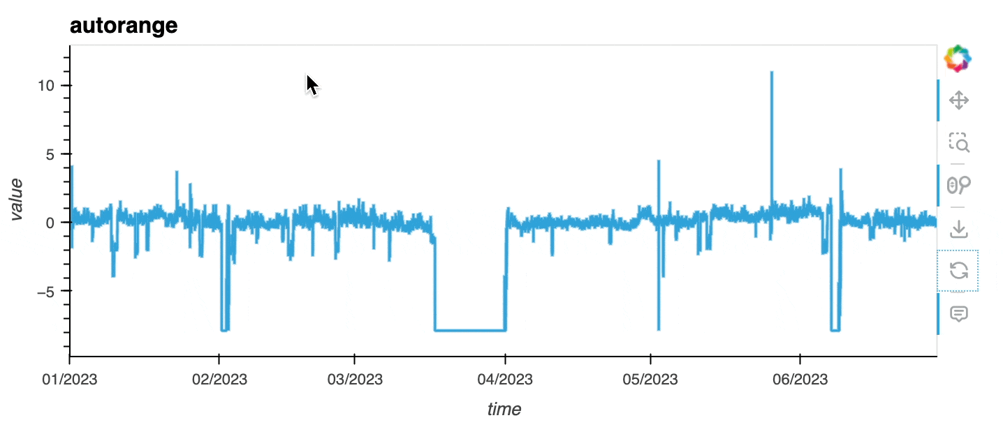
Ideally, to explore large timeseries you should be able to display all the data in your browser, except that, you may crash it if the dataset is too large 🙃! The Large Timeseries Data guide goes over a few methods that are exposed in hvPlot to let you explore even the largest datasets. One option consists in downsampling the dataset before rendering it. hvPlot lets you now downsample timeseries appropriately with the Largest Triangle Three Buckets (LTTB) algorithm, which allows data points not contributing significantly to the visible shape to be dropped, reducing significantly the amount of data to send to the browser but preserving the appearance (and particularly the envelope, i.e. highest and lowest values in a region).
As you can see below, the downsampled timeseries looks very close to the original one, while preserving most of its properties. Note that the downsampled timeseries is re-computed on every zoom and pan event based on the data available in the viewport.
df0.hvplot(x="time", y="value", color='#003366', label = "All the data") * \
df0.hvplot(x="time", y="value", color='#00B3B3', label="LTTB", title="LTTB",
           alpha=.8, downsample=True);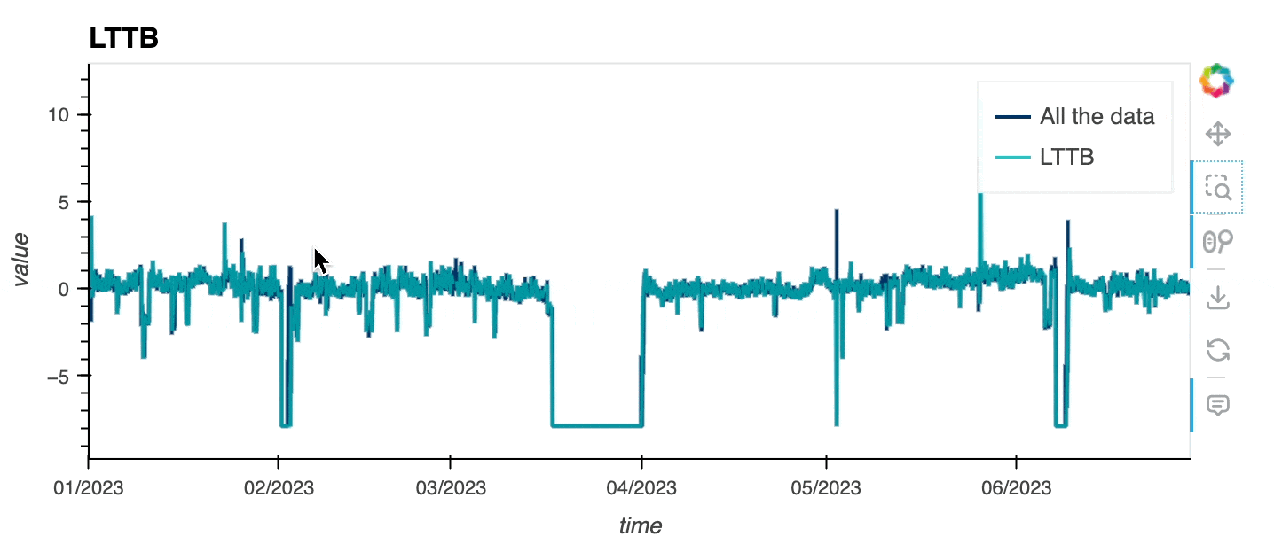
Improved contributor experience (0.10)
There’s still a lot of work to do to improve hvPlot and finally release version 1.0. We would love for the community to contribute more to the project, and to that end we have started to streamline the overall contributor experience.
- The HoloViz ecosystem has relied for many years on a custom developer tool called
pyctdev, which was less and less maintained and made it paradoxically quite challenging for contributors to set up their development environment.pyctdevbelongs now to the past! We have migrated to a more classic approach by which users can install a development environment with eitherpiporconda. Check out the developer guide for more details, and expect more improvements in that area over the next months. - Like many others in the Python ecosystem, we have adopted
ruffas hvPlot’s formatter and linter, running automatically on commits thanks topre-commit. The code base was never automatically formatted and linting was pretty loose, so this is all going in the right direction!
Enhanced plotting API (0.10)
The HoloViz project received a NumFocus Small Development Grant to revitalize the HoloViz website for enhanced Learning and community engagement. This currently ongoing project, conducted by @Azaya89 and @jtao1, has mostly focused on modernizing the HoloViz Examples Gallery, with for instance, migrating some pure HoloViews code to hvPlot. This work has highlighted small gaps in hvPlot’s API, that prevented us from fully migrating away from HoloViews even for very simple use cases.
The tiles parameter has gained support for xyzservices tile providers, increasing greatly the number of tiles available. The new tiles_opts parameter accepts a dictionary of options that are applied to the tile layer created when tiles is set.
import xyzservices.providers as xyz

df = pd.DataFrame({
    'City': ['Paris', 'London', 'Berlin'],
    'x': [277183.93, -13950.96, 1496476.64],
    'y': [6241780.53, 6713002.08, 6891684.23],
})

df.hvplot.points(x='x', y='y', tiles=xyz.CartoDB.Positron, tiles_opts={'alpha': 0.5})
The new bgcolor parameter allows setting the background color.
NUM = 1_000_000
dists = [
    pd.DataFrame(dict(x=np.random.normal(x, s, NUM), y=np.random.normal(y, s, NUM)))
     for x, y, s in [
       ( 5,  2, 0.20),
       ( 2, -4, 0.10),
       (-2, -3, 0.50),
       (-5,  2, 1.00),
       ( 0,  0, 3.00)]
]
df_large_data = pd.concat(dists, ignore_index=True)
df_large_data.hvplot.points(
    'x', 'y', datashade=True, cnorm='eq_hist', aspect=1, colorbar=False,
    cmap='fire', bgcolor='black'
)
The new robust parameter mimics the behavior of Xarray’s robust parameter, providing a simple way to limit the colormap range to the values between the 2nd and 98th percentiles.
airtemps = xr.tutorial.open_dataset("air_temperature")
air_outliers = airtemps.air.isel(time=0).copy()
air_outliers[0, 0] = 100
air_outliers[-1, -1] = 400
(air_outliers.hvplot() + air_outliers.hvplot(robust=True)).cols(1)
Improved documentation (0.9 and 0.10)
The reference gallery was extended to include more Xarray examples.
We have also clarified the structure and content of the Geographic data guide. Finally, we have replaced Google Analytics (which we didn’t use much anyway!) with GoatCounter.
Roadmap
The improvements introduced above are in line with the newly established roadmap which includes:
- Documentation, documentation, documentation!
- Streamline the developer experience
- Bug fixes
- Figure out the future of the
.interactiveAPI - Expose features from HoloViews
- Improve the Explorer
- Increase hvPlot’s presence within PyData
- Prepare for hvPlot 1.0 in 2025
Join us on Github, Discourse or Discord to help us make all this happen!