Panel 0.11.0 Release
release
panel
Release announcement for Panel 0.11
What is Panel?
Panel is an open-source library that lets you create custom interactive web apps and dashboards by connecting widgets to plots, images, tables, and text - all while writing only Python!
Panel integrates seamlessly with your existing work:
- Your code: Step into Panel with your existing work :) Continue to use the PyData ecosystem that you already know and love: matplotlib, seaborn, ggplot, bokeh, plotly, altair, echarts, holoviews, dask, datashader, and more!
- Your workflows: Move the same code freely between a Jupyter Notebook (or other interactive prompt), your IDE, and a fully deployable standalone server. Easily switch between exploring your data, building visualizations, adding custom interactivity, sharing with non-technical users, and back again at any point, using the same tools and code throughout.
Please check out the Panel website to find out more.
New release!
We are very pleased to announce the 0.11 release of Panel! This release focuses on adding a number of powerful features requested by our users, including:
- A new easy-to-use Template built on the Fast UI framework
- Add
--autoreloadfunctionality to the Panel server to improve the development experience - Add
Tabulatorwidget providing a feature-rich data table - Add
Perspectivewidget for performant, interactive analytics - Add
IDOMsupport building on the idom library to build interactive HTML/JS components in Python - Add
loadingparameter to all components to indicate loading state using a spinner - Add
TextToSpeechandSpeechToTextwidgets - Add
Trendindicator to display KPIs in your application
Crucially this release also provides compatibility with Bokeh>=2.3. For a full overview of the changes in this release view the release notes.
Many, many thanks to the people who contributed to this release, including @philippjfr (author, maintainer, release manager), @MarcSkovMadsen, @xavArtley, @hyamanieu, @cloud-rocket, @kcpevey, @kaseyrussell, @miliante, and @AjayThorve.
If you are using Anaconda, you can get the latest Panel with conda install -c pyviz panel , and using pip you can install it with pip install panel.
Autoreload
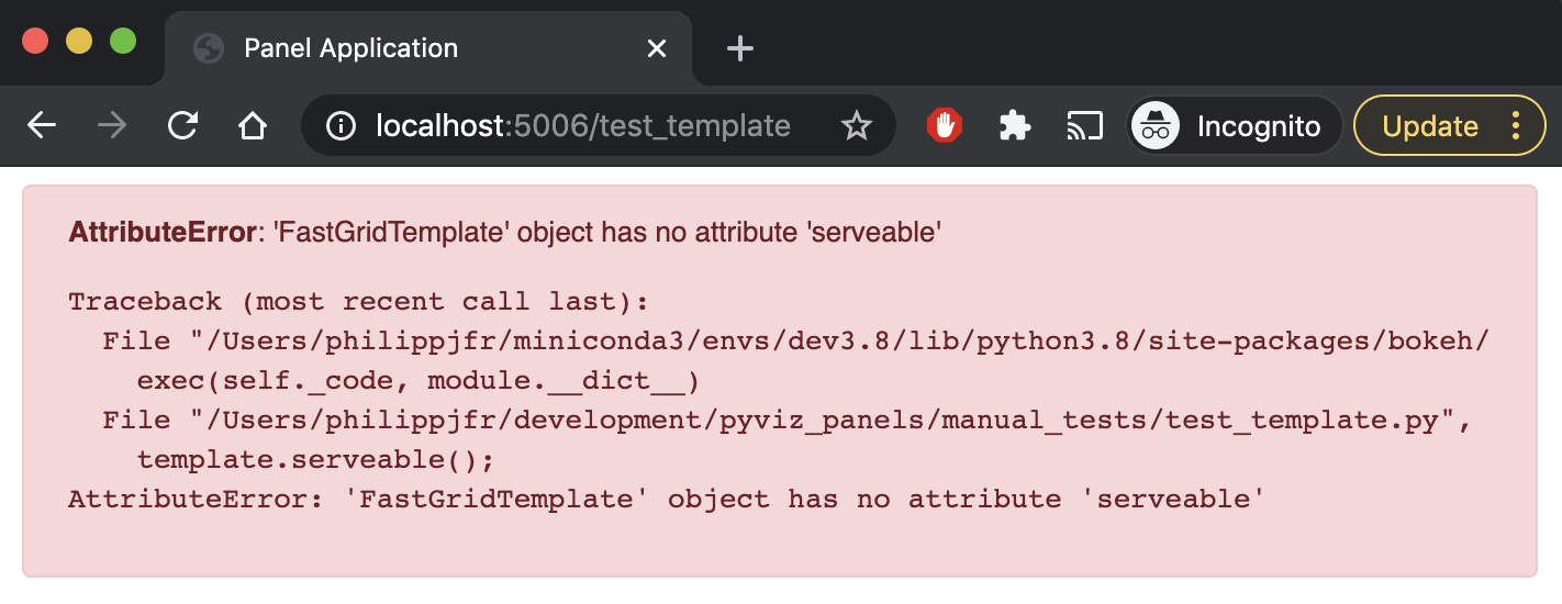
Developing applications is an iterative process but previously it could be quite cumbersome to do so effectively when editing the application in an editor. To improve this we have added a --autoreload flag to the panel serve CLI command. When autoreload is set the source files in the script are watched and the browser view is reloaded when a file is changed.
The --autoreload option even handles error conditions gracefully. If the application script cannot be executed the error is displayed in place of the application:
Loading parameter
To provide users of an application or dashboard with a good user experience and a feeling of responsiveness loading spinners and indicators are very important. Therefore this release has added a loading parameter to all Panel components which overlays the component with a spinner. Panel provides a selection of spinner types to choose from, which can be controlled globally using the config object:
pn.config.loading_spinner: The style of the global loading indicator, e.g. ‘arcs’, ‘bars’, ‘dots’, ‘petals’.pn.config.loading_color: The color of the global loading indicator as a hex color, e.g. #6a6a6a.
pn.Row(*(pn.pane.SVG(open(pn.io.resources.ASSETS_DIR / f'{spinner}_spinner.svg').read().format(color='green'), height=200, width=200)
         for spinner in pn.config.param.loading_spinner.objects))
The loading parameter can be controlled from Python to indicate a component is loading but can also be used directly from Javascript. Below you can see a demo of the default loading indicator and toggle it on and off using the jslinked checkbox:
html = pn.pane.HTML(width=200, height=200, background='black', loading=True)

pn.Column(
    html.controls(['loading'], jslink=True)[1],
    html
)
Templates
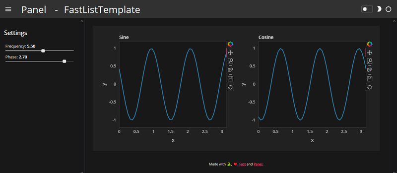
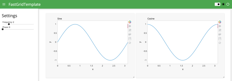
In the 0.10 release Panel introduced the concept of easily reusable templates and shipped a number of default templates. In this release the templates were further polished to achieve a more consistent look and feel when using the DarkTheme. Additionally we made it possible to add custom CSS and JS files directly on a template using the Template.config object, making it possible to add different resources to different routes in an application.
Finally we added a new Fast UI based templates to join the lineup of templates provided by Panel.
FastListTemplate: Builds on the Fast UI framework, making it easy to build polished looking applications and dashboards.
FastGridTemplate: Builds on the Fast UI framework and react grid layouts, making it easy to build responsive, resizable and draggable grid layouts.
Components
This release adds a number of new components to include in your applications and dashboards.
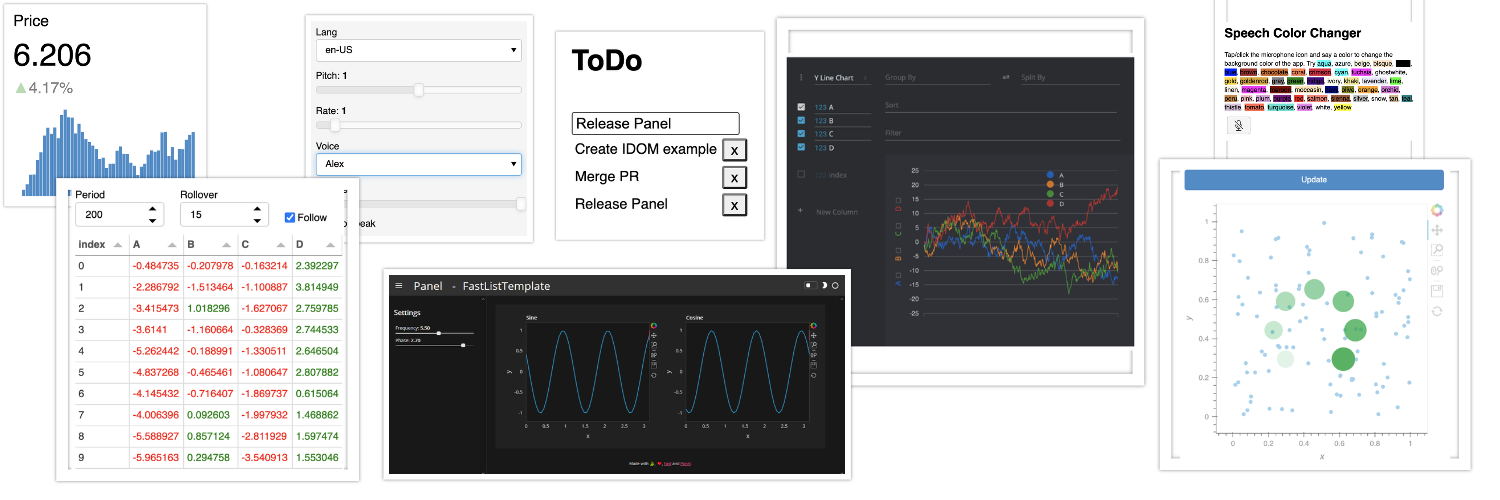
Tabulator widget
Powerful data tables or grids are an essential part of many data-centric applications and this release includes the feature-rich Tabulator component. This new table or data-grid is built on the Tabulator.js library, which is highly extensible, performant and feature rich.
df = pd.DataFrame(np.random.randn(1000, 4), columns=list('ABCD'))

tabulator = pn.widgets.Tabulator(
    df, pagination='remote',
    frozen_columns=['index'],
    selectable='checkbox',
    page_size=10
)

# Pandas styling API
tabulator.style.applymap(lambda v: 'color: green' if v > 0 else 'color: red')

tabulator
Note that the pagination requires a live server to dynamically fetch new data.
Some highlights of include:
- Rich formatters and editors
- Intelligent column layout and resizing
- Pandas
.styleAPI to achieve custom look and feel - Remote pagination support to handle very large tables
- Wide range of themes to choose from
- Support for freezing and grouping columns and rows
- Powerful filtering API
- Ability to download table data directly in Javascript
- Efficient streaming and patching of data
To see more detail find the documentation in the Panel reference guide.
FINOS Perspective
Perspective is an interactive visualization component for large, real-time datasets. Originally developed for J.P. Morgan’s trading business, Perspective makes it simple to build real-time & user configurable analytics entirely in the browser. The Perspective component
perspective = pn.pane.Perspective(
    df.cumsum(), plugin='d3_y_line', columns=['A', 'B', 'C', 'D'], theme='material-dark',
    sizing_mode='stretch_width', height=500
)

perspective
See more details in the Perspective reference gallery entry.
IDOM support
IDOM is a Python library for defining and controlling interactive webpages. It allows us to write interactive HTML components directly from Python and embed those in a Panel application, e.g. below we define a Slideshow component consisting of an img element with a callback which advances the image index on click.
@idom.component
def Slideshow():
    index, set_index = idom.hooks.use_state(0)

    def next_image(event):
        set_index(index + 1)

    return idom.html.img(
        {
            "src": f"https://picsum.photos/800/300?image={index}",
            "style": {"cursor": "pointer"},
            "onClick": next_image,
        }
    )

pn.pane.IDOM(Slideshow, height=300);
See more details in the IDOM reference gallery entry.
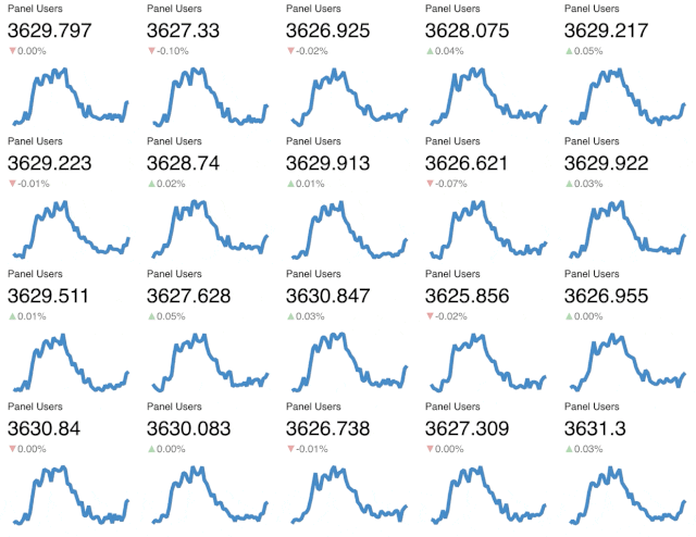
Trend indicator
A common need for dashboards is communicating key performance indicator (KPIs) in a visually clean form. This release adds the Trend indicator to the existing lineup of indicators. The Trend indicator shows a number, a change indicator and a plot and responsively resizes to fill the available space. It also provides methods to stream new data to the view:
trend = pn.indicators.Trend(
    title="Panel Users",
    plot_type='line',
    data={"x": [0, 1, 2, 3, 4, 5], "y": [300, 3800, 3700, 3800, 3900, 4000]},
    height=300,
    width=300
)

controls = trend.controls(jslink=True).clone(scroll=True, height=355)

pn.Row(controls, trend)
The ability to stream allows us to performantly update many views at once:
TextToSpeech and SpeechToText
The TextToSpeech and SpeechToText widgets as their nams suggests turn text into speech and speech into text using the browser APIs.
Roadmap
This release has included a ton of great features but many of the roadmap items from the previous release are still open.
Custom components
With the IDOM pane users can now build custom HTML components however in the future we also want to provide expert users with the power to develop their own HTML objects (including custom WebComponents), using native Panel implementation.
Templated layouts
Complementing the ability to define individual custom components, we want to allow users to declare custom layouts by writing small HTML template strings the components will be inserted into. This will make it possible to leverage custom CSS or JS frameworks, e.g. to build custom types of responsive grids that can be used just like the current Panel layouts (Row, Column, etc.).
Responsive grids
In addition to allowing users to build custom layouts using their favorite CSS/JS frameworks, we also want to ship a well-suported responsive grid layout that reflows components on the page based on the size of the browser tab. Reflowing will make it much easier to provide a great experience on mobile devices.
Better debugging and profiling
We also want to make the process of desiging, building, debugging, and optimizing apps easier. We plan to develop new tools to visualize Panel and Param callback and dependency graphs, to help developers understand how data and events propagate through their panels. To help them identify performance bottlenecks, these graphs will be annotated with timing information so that the slow steps can easily be identified.
Documentation overhaul
As we approach a Panel 1.0 release we want to overhaul the documentation so it becomes much easier to find the information you are looking for.
Help us!
Panel is an open-source project and we are always looking for new contributors. Join us the discussion on the Discourse and we would be very excited to get you started contributing! Also please get in touch with us if you work at an organization that would like to support future Panel development, fund new Panel features, or set up a support contract.
Sponsors
Many thanks to our existing sponsors:

|

|
|
</div>