Panel 0.10.0 Release
release
panel
Release announcement for Panel 0.10
What is Panel?
Panel is an open-source library that lets you create custom interactive web apps and dashboards by connecting widgets to plots, images, tables, and text - all while writing only Python!
Panel integrates seamlessly with your existing work:
- Your code: Step into Panel with your existing work :) Continue to use the PyData ecosystem that you already know and love: matplotlib, seaborn, ggplot, bokeh, plotly, altair, echarts, holoviews, dask, datashader, and more!
- Your workflows: Move the same code freely between a Jupyter Notebook (or other interactive prompt), your IDE, and a fully deployable standalone server. Easily switch between exploring your data, building visualizations, adding custom interactivity, sharing with non-technical users, and back again at any point, using the same tools and code throughout.
Please check out the Panel website to find out more.
New release!
We are very pleased to announce the 0.10 release of Panel! This release focuses on adding a number of powerful features requested by our users, including:
- A set of easy-to-use Templates built on common CSS frameworks such as Bootstrap, GoldenLayout and MaterialUI
- New layout components like
CardandAccordionlayouts - Support for rendering ipywidgets inside Panel apps
- A new
EChartspane - A set of
Indicators, which are particularly useful for building BI dashboards - Support for authenticated access to Panel apps, via OAuth components for GitHub, Okta, Azure AD, GitLab, or Twitter accounts
- URL parameters for linking directly to the current state of a Panel app, selecting from options by syncing URL parameters to widget values
- Easily serving static assets alongside your application
- Support for adding a REST API to your application for automated querying and monitoring
- Support for deferring computations until the page is rendered and indicating when the server is busy
Many, many thanks to the people who contributed to this release, including @philippjfr (author, maintainer, release manager), @MarkSkovMadsen (alert pane, templates, docs), @xavArtley (VTK improvements, templates, input/spinner widgets), @maximlt (panel serve), @jbednar (docs, reviewing), @kebowen (templates), @ahuang11 (datepicker), @nghenzi (react template, bugfixes), @nritsche (panel serve), @ltalirz (autocomplete input), @BoBednar (docs), @tmikolajczyk, @halilbay, @Hoxbro, and @ceball (testing and automation).
If you are using Anaconda, you can get the latest Panel with conda install -c pyviz panel , and using pip you can install it with pip install panel.
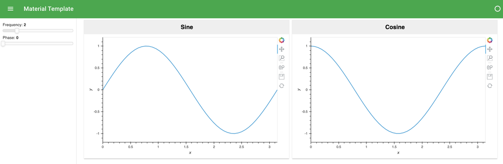
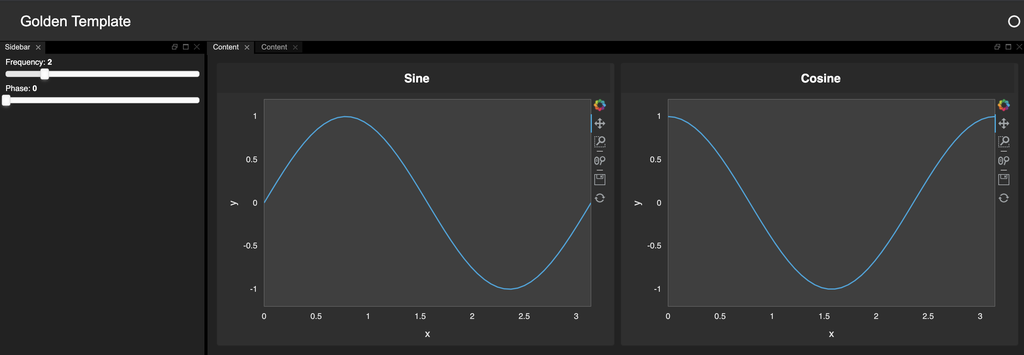
Templates and Themes
Panel has always made it easy to build simple applications quickly and allowed more advanced users to use the Jinja templating system to build more polished dashboards. However in many applications and for many users, building such a custom template added a lot of complexity. This release therefore adds a number of predefined BasicTemplate classes, which are in fact anything but basic. They allow users to easily populate a clean dashboard and build on a number of popular CSS frameworks, straight out of the box. Users can currently choose from:
ReactTemplate: Builds on the react-grid-layout framework, making it easy to build responsive, resizable and draggable grid layouts.
MaterialTemplate: Builds on the Material UI framework using material-components-web
GoldenTemplate: Builds on Golden Layout with the ability to resize individual tabs
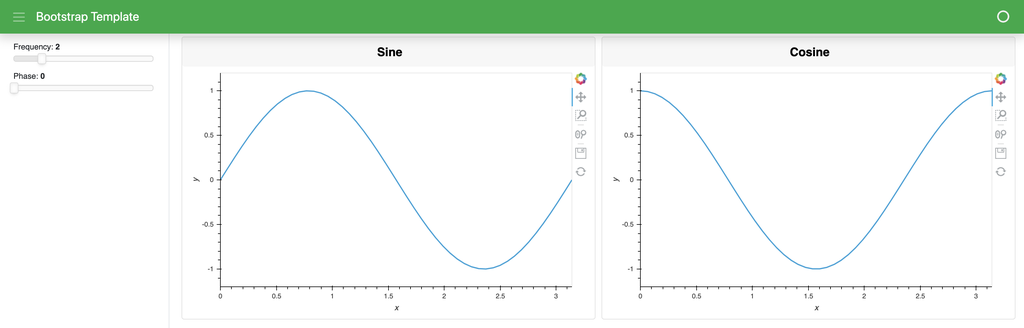
BootstrapTemplate: Builds on the Bootstrap framework.
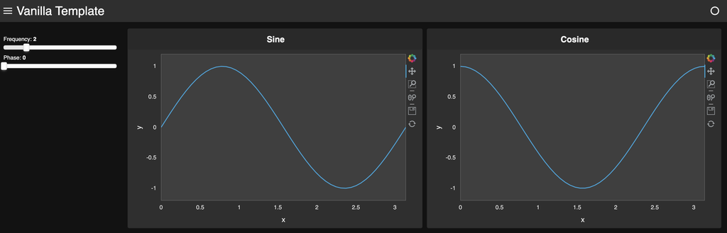
VanillaTemplate: Builds on pure CSS and JS without any external CSS framework.
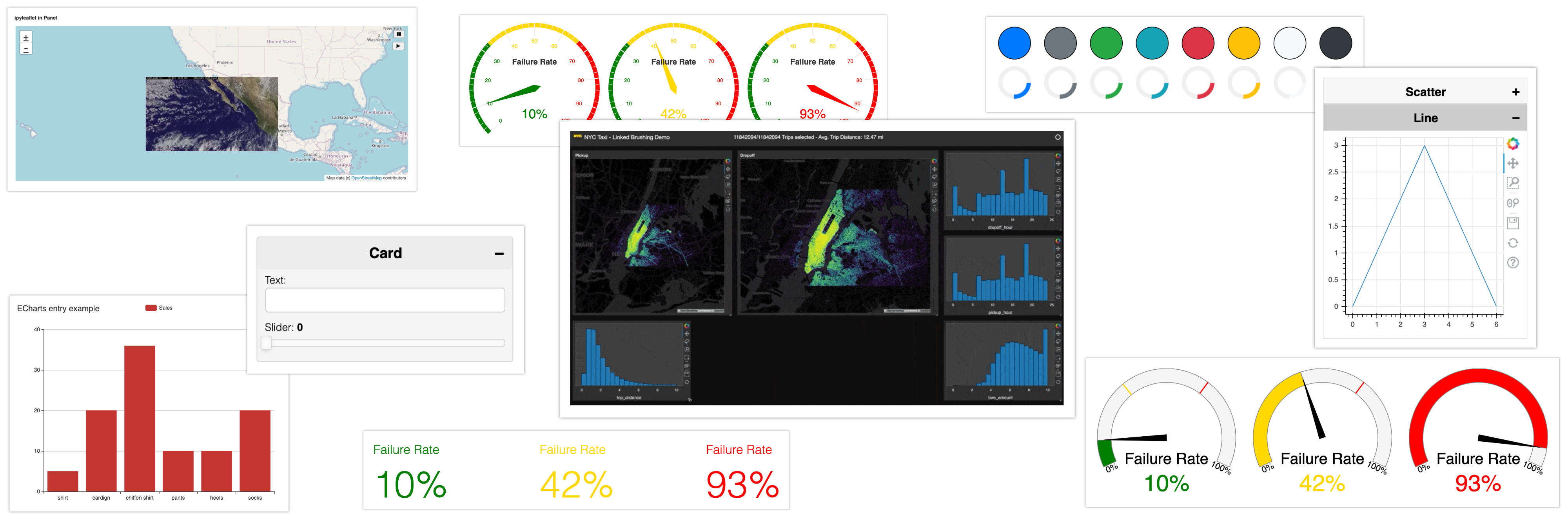
Card and Accordion layouts
The set of standard layout types that are available also expanded this release to include Card and Accordion layouts, which can be incredibly useful when you do not want all the content visible by default.
w1 = pn.widgets.TextInput(name='Text:')
w2 = pn.widgets.FloatSlider(name='Slider')

card = pn.Card(w1, w2, title='Card', background='WhiteSmoke')
card
Clicking on the +/- button will expand and collapse the card. Similarly the Accordion allows stacking multiple cards on top of each other, providing a compact way to lay out multiple components. If toggle=True is set, only one of the cards will be expanded at a time, ensuring a consistently compact layout.
from bokeh.plotting import figure

p1 = figure(width=300, height=300, name='Scatter', margin=5)
p1.scatter([0, 1, 2, 3, 4, 5, 6], [0, 1, 2, 3, 2, 1, 0])

p2 = figure(width=300, height=300, name='Line', margin=5)
p2.line([0, 1, 2, 3, 4, 5, 6], [0, 1, 2, 3, 2, 1, 0])

accordion = pn.Accordion(('Scatter', p1), p2, toggle=True)
accordion
ipywidgets support
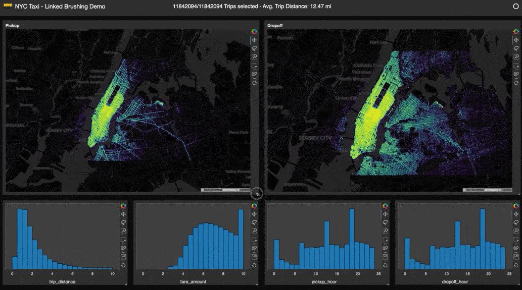
The Bokeh and ipywidgets ecosystems are both thriving but until recently they have not played very well together. Since version 0.7, Panel has supported rendering as an ipywidget, so that Panel components can be used in a library like Voilà:
import ipywidgets as ipw
from ipyleaflet import Map, VideoOverlay

slider = pn.widgets.IntSlider()

pn.Row(
    ipw.VBox([ipw.Label('This is a Bokeh/Panel widget inside an ipywidgets layout:'), pn.ipywidget(slider)]),
    height=100
)
In this release we have also added support for using ipywidgets directly inside your Panel app and even deploying it on the (Bokeh-based) Panel server. Just install ipywidgets_bokeh with conda install -c bokeh ipywidget_bokeh or using pip with pip install ipywidgets_bokeh.
m = Map(center=(25, -115), zoom=4)

video = VideoOverlay(
    url="https://www.mapbox.com/bites/00188/patricia_nasa.webm",
    bounds=((13, -130), (32, -100))
)

m.add_layer(video);

pn.Column(
    '# ipyleaflet in Panel', m,
    sizing_mode='stretch_width'
)
See more examples on how to leverage the IPyWidget in Panel see the reference examples.
Busy indicators
When working with long running computations you often want to give your users an indication that the application is loading or processing. In the past, users had to use custom GIFs to indicate a busy status. This release introduces a growing set of BusyIndicators that allow signalling a busy status visually.
Currently, BooleanStatus and LoadingSpinner types are available. The former simply displays a filled circle to indicate when the app is busy and an empty circle when it is not, while the latter spins to indicate the busy status:
from panel.widgets.indicators import BooleanStatus, LoadingSpinner

pn.Column(
    pn.Row(
        *(BooleanStatus(value=True, width=50, height=50, color=color)
        for color in LoadingSpinner.param.color.objects)
    ),
    pn.Row(
        *(LoadingSpinner(value=True, width=50, height=50, color=color)
        for color in LoadingSpinner.param.color.objects)
    ),
)
This release also adds the pn.state.sync_busy method, which links the indicators to a global busy state. Now, whenever the application is busy processing a request, an indicator can automatically display this state:
spinner = LoadingSpinner()
pn.state.sync_busy(spinner)
This method makes it very straightforward to include such an indicator in your application. As a bonus, the templates mentioned above automatically add such an indicator to the header, so you don’t need to do anything at all to have a busy indicator if you use one of the templates.
ECharts
The ECharts library supports a wide range of plot types and makes it easy to generate polished plots with animated transitions. Panel now supports rendering ECharts from a simple JSON-style specification:
echart = {
    'title': {
        'text': 'ECharts entry example'
    },
    'tooltip': {},
    'legend': {
        'data':['Sales']
    },
    'xAxis': {
        'data': ["shirt","cardign","chiffon shirt","pants","heels","socks"]
    },
    'yAxis': {},
    'series': [{
        'name': 'Sales',
        'type': 'bar',
        'data': [5, 20, 36, 10, 10, 20]
    }],
};

plot_type = pn.widgets.Select(name="Plot type", options=['bar', 'line', 'scatter'], value='bar')

echart_pane = pn.pane.ECharts(echart, height=480, width=640)

plot_type.jscallback(args={'echart': echart_pane}, value="""
echart.data.series[0].type = cb_obj.value
echart.properties.data.change.emit()
""")

pn.Column(plot_type, echart_pane)
Indicators
This release also includes a number of ValueIndicator types, similar to the BooleanIndicator components we discussed above. A ValueIndicator provides a quick way to visualize a scalar, numeric value, which comes in very useful for building BI dashboards.
Dial
dial = pn.indicators.Dial(
    name='Failure Rate', value=72, format='{value}%', bounds=(0, 100),
    colors=[(0.33, 'green'), (0.66, 'gold'), (1, 'red')]
)

pn.Row(dial.clone(value=10), dial.clone(value=42), dial.clone(value=93))
Gauge
gauge = pn.indicators.Gauge(
    name='Failure Rate', value=72, format='{value}%',
    colors=[(.33, 'green'), (.66, 'gold'), (1, 'red')]
)

pn.Row(gauge.clone(value=10), gauge.clone(value=42), gauge.clone(value=93))
Number
number = pn.indicators.Number(
    name='Failure Rate', value=72, format='{value}%',
    colors=[(33, 'green'), (66, 'gold'), (100, 'red')]
)

pn.Row(number.clone(value=10), number.clone(value=42), number.clone(value=93))
Deferred loading
Another useful bit of functionality for making apps feel more responsive, particularly during initial rendering, is the new pn.state.onload method, which allows scheduling a task once the page is rendered. In this way developers can defer long running computations until after the initial app is rendered, so that the user actually sees something on screen from the start. As a simple example, you might have a Column with a message indicating that the app is still loading, which is then replaced with the real contents once the application is rendered:
stocks_url = 'https://raw.githubusercontent.com/vega/datalib/master/test/data/stocks.csv'

select_ticker = pn.widgets.Select(name='Stock Ticker')

def load_data():
    pn.state.cache['stocks'] = df = pd.read_csv(stocks_url, parse_dates=['date']).set_index('symbol')
    symbols = list(df.index.unique())
    select_ticker.options = symbols
    select_ticker.value = symbols[0]

pn.state.onload(load_data)

@pn.depends(select_ticker)
def plot_ticker(ticker):
    if 'stocks' not in pn.state.cache or ticker:
        return pn.indicators.LoadingSpinner(value=True)
    return pn.state.cache['stocks'].loc[ticker].hvplot.line('date', 'price')

pn.Row(select_ticker, plot_ticker).servable()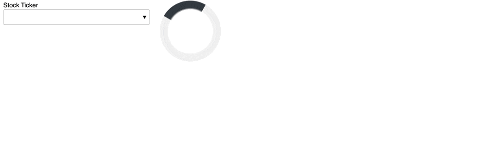
Authenticated Apps
Another common problem users face when publishing an application is to add some form of authentication in front of it, whether to limit the users that can view the app, provide customized content in the app, or simply to keep track of the users who log in. This release ships with a number of OAuth providers, which make it extremely easy to put an authenticated login page in front of your app. After registering an application with one of the currently supported identity providers:
azure: Azure Active Directorybitbucket: Bitbucketgithub: GitHubgitlab: GitLabgoogle: Googleokta: Okta
you can pass in the OAuth configuration as CLI options to panel serve, via environment variables, or you can configure it directly on pn.config. Once configured, the user will be prompted to log in when visiting the app and the information in the returned token will be available from the pn.state.user and pn.state.user_info objects. Read more about authentication in our user guide.
Read and write the URL
Being able to manipulate the URL bar directly from Python makes a wide range of functionality possible in your apps. The new Location component which mirrors the Javascript window.location object makes this possible and can be accessed from pn.state.location in a Panel application. Not only can you now forward the user to a new location by updating the url, but you can sync the query parameters with some state in your application, letting your users share links to the application that persist some of the state. That way users can configure your app for their usage, then save or send a URL that lets the same state be restored when the URL is visited.
You can manipulate the parameters on the Location component directly, which will then be reflected in the URL bar in the browser:
pn.state.locationLocation(hash='', hostname='', href='', name='Location01452', pathname='', port='', protocol='', reload=False, search='')Or use the update_query method to easily update the URL by passing explicit keywords:
pn.state.location.update_query(a=1, b=3)The URL will now reflect these parameters:
http://localhost:5006/app?a=1&b3You can even link the location state automatically with a parameter, e.g. a widget value, which means that on load the widget will reflect the URL parameter and subsequently automatically updates the URL with the current widget value so that the state can be restored when the URL is visited:
widget = pn.widgets.FloatSlider(name='FloatSlider')
pn.state.location.sync(widget, {'value': 'slider_value'})
The URL query parameters will now automatically update to reflect the current slider value:
http://localhost:5006/app?slider_value=0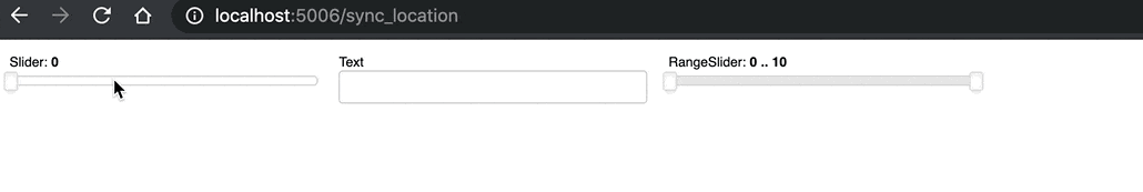
Serving static assets
Another feature users have frequently requested is the ability to publish additional static resources (data files, images, or other media or downloadable objects) alongside the apps and dashboards. This release provides the ability to easily specify static directories to serve, both on the commandline:
panel serve some_script.py --static-dirs assets=./assetsand programmatically:
pn.serve(panel_obj, static_dirs={'assets': './assets'})In both cases the ./assets folder will be served alongside the dashboard at the /assets endpoint.
REST APIs
In addition to serving static assets, you may also want to publish a live REST API alongside your app, to allow automated querying of the state of the app or some data from it. Panel now ships with an extensible set of REST providers that make it trivial to serve up some data or other info with your app. By default Panel ships with two REST providers:
Param REST Provider
The Param REST provider is an easy entry point to publishing data with Panel. Using the pn.state.publish method you can set up an endpoint to publish the parameters of any Parameterized object. As a very simple example, if you serve the following application with panel serve app.py --rest-provider param:
import panel as pn

slider = pn.widgets.FloatSlider()
pn.state.publish('slider', slider, ['value'])

slider.servable()
You will be able to visit: http://localhost:5006/rest/freq, which will return the current slider value:
{"value": 0}This of course works not only for widgets and other panel components, but any Parameterized class, as long as the parameters are JSON serializable.
Tranquilizer REST Provider
The Param provider makes it easy to publish parameter values as-is, while the new Tranquilizer provider makes it easy to publish functions that compute results before returning them. Below we declare a select widget that we sync with the global cache. In the tranquilized order function, we then return a string whose contents depend on the most recently selected order:
import panel as pn

from tranquilizer import tranquilize

select = pn.widgets.Select(options=['Cheddar', 'Mozarella', 'Parmeggiano'], value='Cheddar')

def update_cache(event):
    pn.state.cache['cheese'] = event.new

select.param.watch(update_cache, 'value')

@tranquilize()
def order():
    '''I'd like to buy some cheese!'''
    return f"I'm afraid we're fresh out of {pn.state.cache['cheese'].lower()}, sir."

select.servable()
Now when we serve this app with panel serve app.py --rest-provider tranquilizer, visit http://localhost:5006, select a cheese, and hit http://localhost:5006/rest/order we get back:
"I'm afraid we're fresh out of mozarella, sir."Both of these providers make it very easy to set up a REST endpoint, and other providers can easily be registered.
Roadmap
This release has included a ton of great features and we have many more features planned. Some highlights include:
Polishing templates and themes
This release brought the addition of a number of templates and accompanying themes. While we spent a lot of time making sure these would be general there are many improvements and tweaks that we want to make based on user feedback, so please let us know if you find issues.
Custom components
We want to provide expert users with the power to develop their own HTML objects (including custom WebComponents), then have them appear as Panel components synchronized bi-directionally with the HTML state. To allow this we are working on an API to connect attributes and properties on HTML elements into Python objects, allowing custom components (e.g. new widget types) to be used within Panel just like existing widgets and panes are.
Templated layouts
Complementing the ability to define individual custom components, we want to allow users to declare custom layouts by writing small HTML template strings the components will be inserted into. This will make it possible to leverage custom CSS or JS frameworks, e.g. to build custom types of responsive grids that can be used just like the current Panel layouts (Row, Column, etc.).
Responsive grids
In addition to allowing users to build custom layouts using their favorite CSS/JS frameworks, we also want to ship a well-suported responsive grid layout that reflows components on the page based on the size of the browser tab. Reflowing will make it much easier to provide a great experience on mobile devices.
Better debugging and profiling
We also want to make the process of desiging, building, debugging, and optimizing apps easier. We plan to develop new tools to visualize Panel and Param callback and dependency graphs, to help developers understand how data and events propagate through their panels. To help them identify performance bottlenecks, these graphs will be annotated with timing information so that the slow steps can easily be identified.
Documentation overhaul
As we approach a Panel 1.0 release we want to overhaul the documentation so it becomes much easier to find the information you are looking for.
Help us!
Panel is an open-source project and we are always looking for new contributors. Join us the discussion on the Discourse and we would be very excited to get you started contributing! Also please get in touch with us if you work at an organization that would like to support future Panel development, fund new Panel features, or set up a support contract.
Sponsors
Many thanks to our existing sponsors:

|

|
|