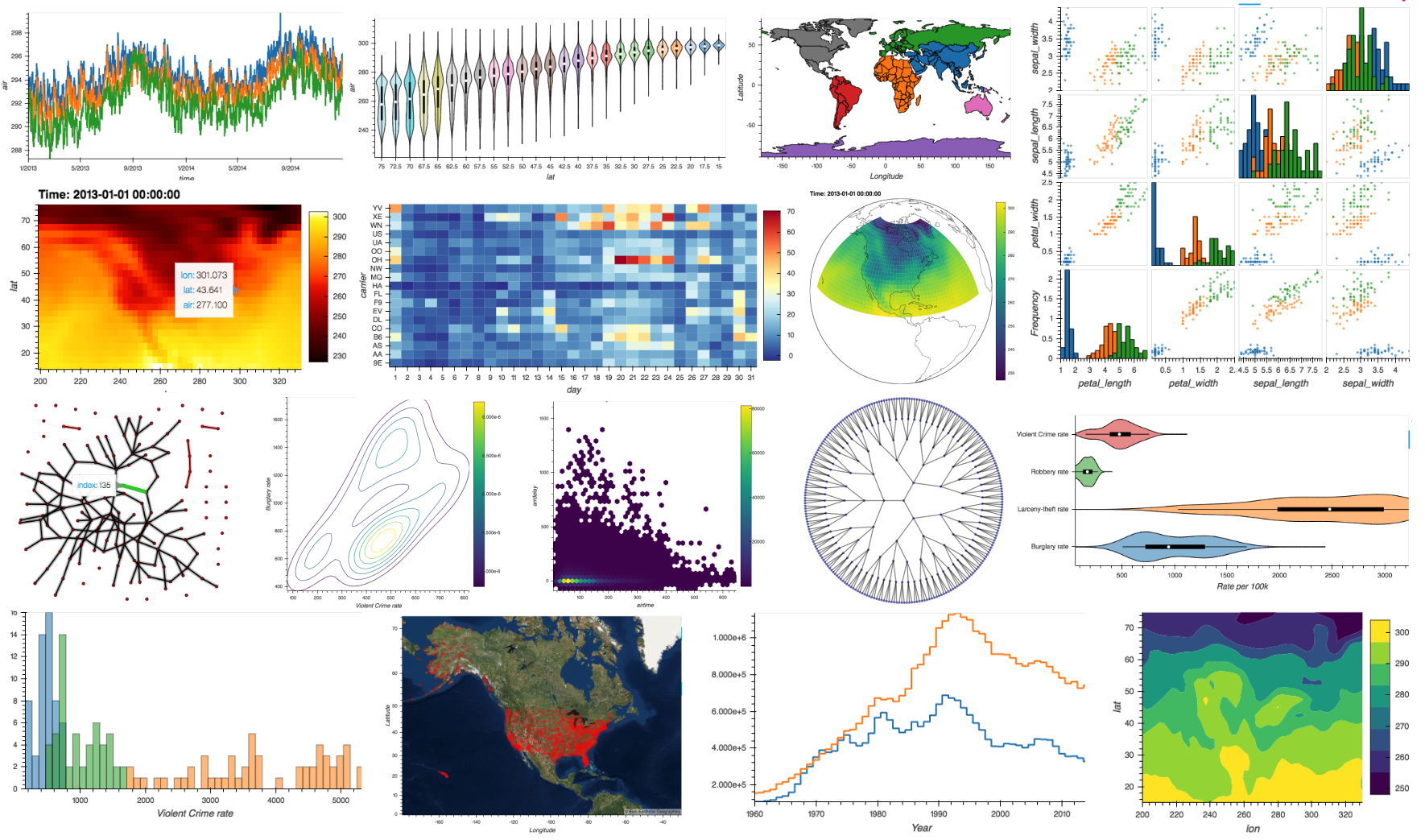
import hvplot.pandas

idx = pd.date_range('1/1/2000', periods=1000)
df  = pd.DataFrame(np.random.randn(1000, 4), index=idx, columns=list('ABCD')).cumsum()

df.hvplot()hvPlot Announcement
announcement
hvplot
Announcing the release of hvPlot

A high-level plotting API for the PyData ecosystem - built on HoloViews.
We are very pleased to introduce a new visualization tool called hvPlot. hvPlot is closely modeled on the Pandas and Xarray .plot APIs, but returns HoloViews objects that display as fully interactive Bokeh-based plots. hvPlot is significantly more powerful than other .plot API tools that have recently become available, because it lets you use data from a wide array of libraries in the PyData ecosystem:
- Pandas: DataFrame, Series (columnar/tabular data)
- xarray: Dataset, DataArray (multidimensional arrays)
- Dask: DataFrame, Series (columnar data)
- Streamz: DataFrame(s), Series(s) (streaming columnar data)
- Intake: DataSource (data catalogs)
- GeoPandas: GeoDataFrame (geometry data)
- NetworkX: Graph (network data)
Why a new library?
The Python visualization landscape is crowded with many confusing alternatives. To make sure that users can easily generate at least the most basic plots, many libraries in the PyData ecosystem ship with their own Matplotlib-based plotting APIs. Matplotlib is a solid and well-established library, but lacks the interactive features of modern web-based plotting tools. With hvPlot, you can use the simple API you are already used to, while getting powerful interactive features by simply switching out an import statement. Because hvPlot aims to provide plotting tools for all the major libraries in the PyData system, plots generated from all these different libraries can then be flexibly combined to make a figure or application. Other .plot API tools like Pandas-Bokeh provide similar basic features but don’t provide this ability to flexibly combine between libraries, nor do they let you:
- Explore multi-dimensional parameter spaces using auto-generated widgets
- Scale visualizations to millions or even billions of datapoints using Dask and Datashader integration
- Explore interactive visualizations (even streaming plots!) in the notebook, then seamlessly transition to a standalone server
A shared, consistent and familiar API
Whether you are plotting Pandas, Xarray, Dask, Streamz, Intake or GeoPandas data, you only need to learn one plotting API, with extensive documentation for all the options.
Interactivity
Let us jump straight into what hvPlot can do by generating a DataFrame containing a number of time series, then plot it. By importing hvplot.pandas we add .hvplot to the pandas DataFrame and Series methods and can immediately start using it. The same concept applies to the other supported libraries, e.g. import hvplot.dask to add the method to dask DataFrame/Series objects.
Thanks to Bokeh, we automatically get a fully interactive plot with hover, zoom, and an interactive legend.
Fully tab-completable
When working in a Jupyter(Lab) notebook or an IPython prompt both the plot types and the supported options are fully tab-completable, making the options easily discoverable.
A wide-range of plot types
As you have seen in the collage, hvPlot supports a wide range of plot types including line, scatter, area, step, bar, box-whisker, violin, KDE, hexbin, histogram, image, contour, filled contour, polygon, and graph plots.
columns = ['Burglary rate', 'Larceny-theft rate', 'Robbery rate', 'Violent Crime rate']
crime.hvplot.violin(y=columns, group_label='Type of crime',
                    value_label='Rate per 100k', invert=True)
Support for geographic plots
Thanks to integration with GeoViews and Cartopy we can ingest and project data from and to any coordinate system, letting you combine columnar data from pandas, gridded data from xarray, and shape data from GeoPandas, while letting GeoViews handle projections for each one automatically.
import xarray as xr
import hvplot.xarray
import cartopy.crs as crs
import geoviews as gv

air_ds = xr.tutorial.open_dataset('air_temperature').load()
air_temp = air_ds.air.isel(time=0)
proj = crs.Orthographic(-90, 30)

air_plot = air_temp.hvplot.quadmesh(
    'lon', 'lat', projection=proj, project=True, global_extent=True,
    width=525, height=450, cmap='viridis', rasterize=True)

air_plot * gv.feature.coastline
Streaming data
With the streamz library we can easily generate streaming plots, which efficiently stream the data when a streamz.DataFrame object is updated.
import hvplot.streamz
from streamz.dataframe import Random

streaming_df = Random(freq='50ms', interval='100ms')
rolling_df = streaming_df.rolling('500ms').mean()

(rolling_df.hvplot.hexbin(x='x', y='z', backlog=2000, height=400, width=500, padding=0.1) +
 rolling_df.hvplot(backlog=100, height=400, width=500))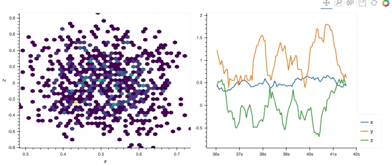
Network graphs
In addition to the general plotting API supported for the other libraries, hvPlot also ships with a plotting interface for NetworkX that mirrors the plotting functions in the nx. (networkx) namespace. The hvnx namespace as defined below therefore provides a drop-in replacement for the usual plotting functions, letting you plot interactive graphs with nodes, edges and labels:
import networkx as nx
import hvplot.networkx as hvnx

G = nx.karate_club_graph()

hvnx.draw_spring(G, labels='club', font_size='10pt', node_color='club', cmap='Category10', width=500, height=500)
Datashader integration
When your data is larger than can ordinarily be plotted, hvPlot makes it incredibly simple to activate datashading, which will dynamically aggregate your data as appropriate for your current zoom level. This approach allows plotting millions or even billions of datapoints in an ordinary web browser. Below, we are loading and then displaying 300 million datapoints (one for every resident in the 2010 US census), using Dask and Datashader:
import hvplot.dask
import dask.dataframe as dd

ddf = dd.read_parquet('/Users/philippjfr/datashader/examples/data/census.parq/').persist()
gv.tile_sources.CartoDark * ddf.hvplot.points('meterswest', 'metersnorth', datashade=True, cmap='viridis', height=500)
Intake catalogs
The Intake library provides a plugin system for loading your data and defining data catalogs. On top of the many different types of data it supports via various plugins, it also natively supports hvPlot as part of its YAML catalog specification. This means you can define custom plots declaratively as part of a catalog definition so that people who use that data can visualize it directly.
sources:
  nyc_taxi:
    description: NYC Taxi dataset
    driver: parquet
    args:
      urlpath: 's3://datashader-data/nyc_taxi_wide.parq'
    metadata:
      plots:
        dropoff_scatter:
          kind: scatter
          x: dropoff_x
          y: dropoff_y
          datashade: True
          width: 800
          height: 600
To view a plot defined in a catalog, just call it by name, e.g. intake.cat.nyc_taxi.hvplot.dropoff_scatter()
Try it out
We hope you’ll give hvPlot a try and it makes your visualization workflows a little bit easier and more interactive. Let us know how it goes and don’t hesitate to file issues or make suggestions for improvements for the library. To get started, follow the installation instructions below and visit the website. Also check out pyviz.org for information about the other PyViz libraries, all of which work well with hvPlot.
Installation
hvPlot supports Python 2.7, 3.5, 3.6 and 3.7 on Linux, Windows, or Mac and can be installed with conda:
conda install -c pyviz hvplotor with pip:
pip install hvplotFor JupyterLab support, the jupyterlab_pyviz extension is also required::
jupyter labextension install @pyviz/jupyterlab_pyvizAcknowledgements
hvPlot was built with the support of Anaconda Inc.. Special thanks to all the contributors:
- Philipp Rudiger (@philippjfr)
- Julia Signell (@jsignell)
- James A. Bednar (@jbednar)
- Andrew Huang (@ahuang11)
- Jean-Luc Stevens (@jlstevens)